 yesterday's drawing of same chair, different person! I see the perspective on the chair is still off -something to work on!
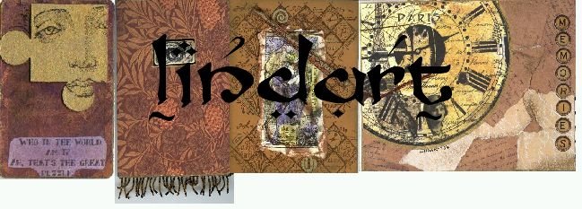
Some new cards for Altered Pages Kit
I have designed some new tag cards for Altered Pages, if you buy the kit from them you get cs, images, paper, ribbon and instructions!


She has all kinds of other cool kits too, check them out!
And my DD's boyfriend has a birthday coming up, so I made him a card. I'm sure he never looks at my site, so I don't think I'll be giving anything away!
That's it for now!


3 comments:
I love your site (as anybody would that sees it)
your affection for the green chair is obvious--the "trouble" you speak of can not be one, if you like the effect your sketch has. If it bothers you, keep in mind that perspective views go back into space and get smaller as they recede...like rail road tracks---so this would apply to the chiar lines as they go back---there's some really cool beginner perspective books out there---that's what you want--one that is clear and elementary---this will help. At the same time, your sketches look real and interesting--like your view and not something a camera could capture---your collaged items are very very well done...I love the antique subtle colors used--Winna
Improved a bit you said? ^^ I think the improvement is just so much! The colors used, brave and vibrant, the shadings and contrast, confident and yet fine lines all over, and background with books in the shelves... I mean, you score so high in terms of creating depth. I see it, and I'm interested to know what is he reading, how long has he been reading that..and all kinds of questions. ^^ It's a good art work!
Love your blog--such creative talent & inspiration here. Also a very calming place--always nice!
Keep up the great work!
Nola
Post a Comment